Pantone Color of the Year 2020
When Pantone announced their Color of The Year for 2020, we knew it was going to be one of our favorites! It is a familiar, calming color called "Classic Blue," which we love to use a variation of in our color palettes when designing our client's homes. This quote from Architectural Digest sums up perfectly why we gravitate towards this particular hue:
"Blue, from an emotional, psychological standpoint, has always represented certain amount of calm and dependability. It's a color that you can rely on."
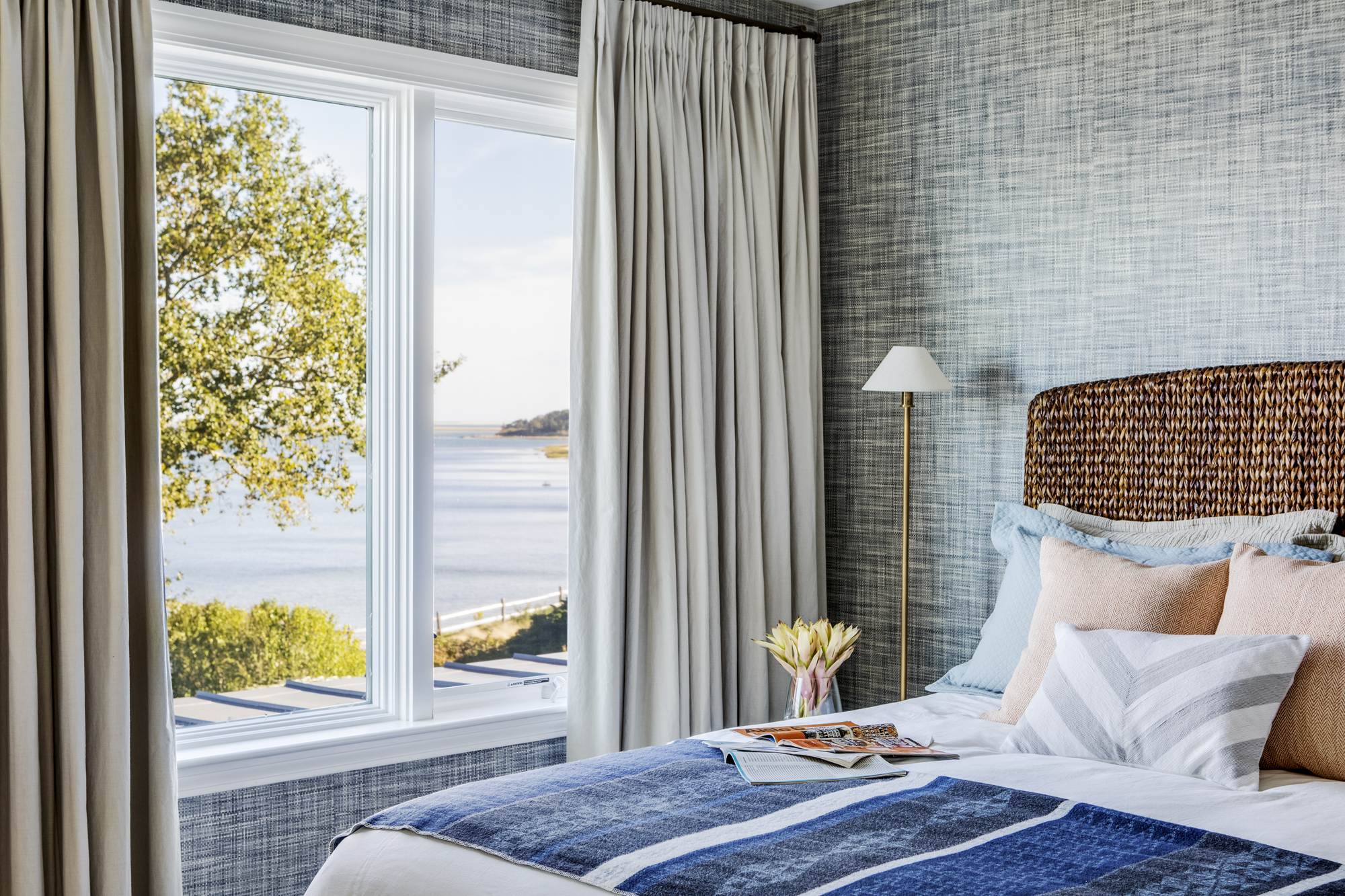
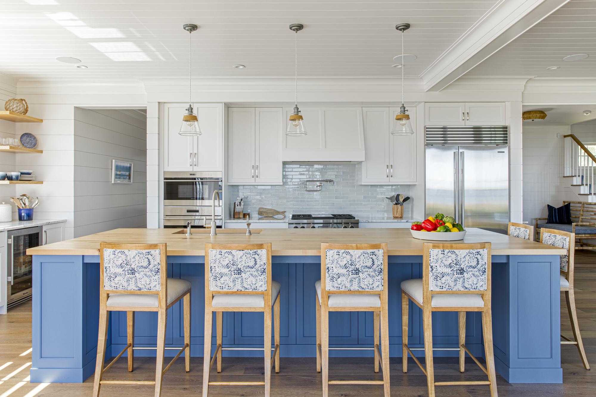
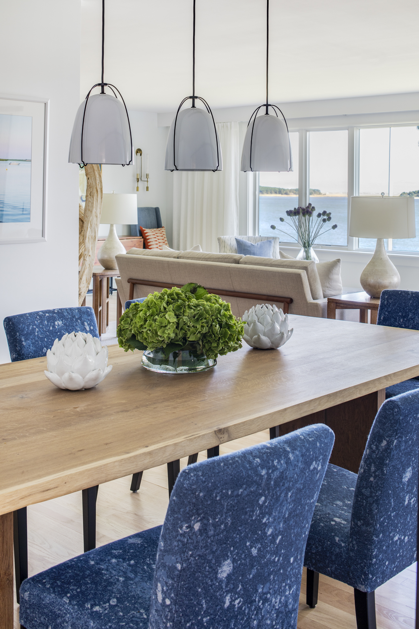
In a world full of uncertainties right now, this sounds spot on to us! Now more than ever, we are trying to create a sense of serenity in our home to deviate from the stress of day to day life. We find any shade of blue to be a grounding element, one that makes us step back and breathe a sigh of relief (even if it's only for second!) From kitchen cabinets to casual throw blankets, see how we have incorporated shades of "Classic Blue" in some of our projects below: